Парадокс-М
UI concept / Simulated Interaction
This is an IoT-themed abstract interface, projected on a glass. Touch inputs are simulated.
▓░░░░░ Intro


▓▓░░░░ Hub Menu


▓▓▓░░░ Loading


▓▓▓▓░░ Phase A


▓▓▓▓▓░ Phase B


▓▓▓▓▓▓ Final


Making of
Inspiration
I enjoy how new hardware paradigms are being pioneered. Early GUI concepts such as the Teleporter widget (Xerox PERC Alternate Reality Kit, 1985) inspire me to rethink the common approaches to interface design.
While I was studying the application of the 80s CRT touch screen systems (Buick Reatta's "Graphic Control Center" and Unity Systems' "Home Manager") I became haunted by their aesthetics, and built a transparent display for my PC. It became a canvas for this project.

Secondary display of my PC
The "display" was made out of glass with a rear projection film layer, and a pico projector connected to my PC via HDMI. The projector and the glass are fixed in space with a set of clamps.
Sketches
I've screened some references, to check how different graphics look on the glass, and then started sketching.
I was exploring a wide variety of visual systems, ranging from old computer shells, to Soviet aircraft HUDs. During my graphic archaeology practice, every item I found one that was special to me, I would reflect their aesthetics in my design.

Études
As soon as I had enough ideas for creating visual vocabulary and layouts, I moved to production.
Style
The next step was to settle down with a certain style for rendering graphics. I wanted my stylistic decisions to be informed by the medium, so I've built a system for previewing graphics in real time.

The camera is pointed at the glass, and is streaming to OBS
Having a framed shot right next to my viewport boosted my design process. I was able to quickly iterate on fonts and shapes, keeping everything readable in different light conditions.
Fine-tuning the graphics become a fun and easy task
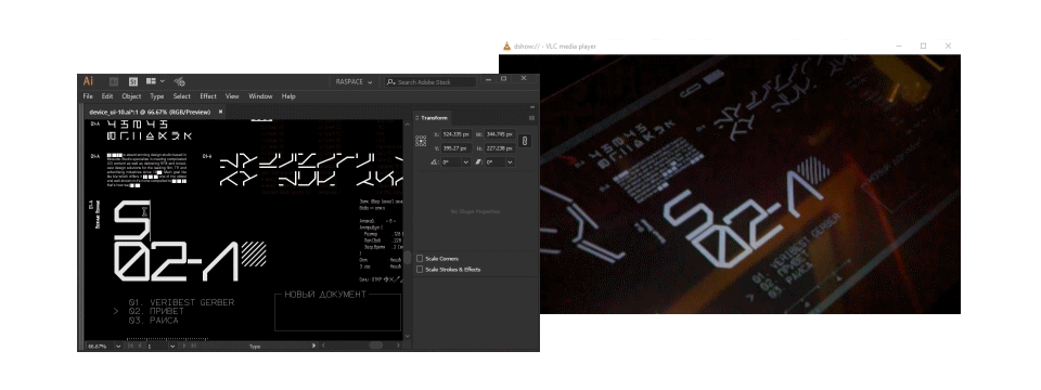
Vector displays were one of my aesthetic references. I really enjoy their look, so I decided to use single-line fonts in my design.
The primary font pair I chose is Gerber and Гост. Their font weights were always kept equal to the stroke widths of the graphics. I was also adding pinches of my Piata Dub, Lume Dub and Kueri Dub fonts here and there.
Concept
I wanted my interface to start with a hub menu, used for accessing five different menu items. Each menu item is a sequence demonstrating different UI concepts, and featuring different gestures.

All my sketches shaped into five sequences
After drafting the sequences I made them into five still-o-matics, and started iterating on timings, and on hand choreography. I output the still-o-matics onto the glass to rehearse the gestures.

I'd been filming myself to review if my hands were moving nicely, and weren't obstructing the view. After review, I made all the necessary adjustments to the animation blocking.
Design
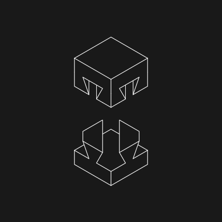
Next goes the visual vocabulary. I have created plenty of assets: shape libraries, widgets, boot sequences, loading screens, icons, preloaders, buttons, gauges, grids, flowcharts, scrollbars, etc.

All of the above laid on the foundation of five layouts. Each of the five sequences consisted of four phases, smoothly transitioning from one to another.

Animated transitions
I was going to film each of these sequences separately, and turn this project into a five episode miniseries.
However, creating assets and putting them together took me a while! And since I haven't even started animating, filming and editing, I made a decision to leave only one sequence out of five, and focus on polishing it 💀
Animation
As soon as I had my design looking cool and unusual enough, I proceeded with setting it in motion. I had a lot of fun making things flow, and seasoning them with mecha anime gubbins, and Sega Saturn video display processor artefacts.
Here is the complete sequence of Episode V:

720p @ 25 fps, no motion blur
Interactive playback system
The end product is a video, so I decided not to spend my time engineering an input system, and focus on creating graphics. Simulated touch input is a technique I use to cut R&D costs, and to enjoy playing with different ideas, seeing them work.

Колба (2021)
However, since the sequence became quite long, I considered creating an interactive playback system to help me with filming.

TouchDesigner patch
I used a Leap Motion sensor for touch registration, and cueing the clips. Unfortunately, hand detection wasn't precise enough in my setup, so I dropped this idea.
Filming
I started with filming several tests, figuring out the best lighting and camera setup for the given location, and my equipment.

I was experimenting with different types of camera movement and shot composition. Furthermore, I also did a few takes in slo-mo, in an attempt to combat DLP projector artefacts, and to give myself some headroom for gestures performance.
After numerous takes, I did a few edits of my footage, trying to tell different stories. Then I changed my mind for a continuous shot, helping me to focus on what's important.

Outtakes / Close-ups
And that's how it was done


"5 минут на размышление" (Moscow, 1950)


